Line Plot Template: A Quick Guide to Visualizing Data
Welcome to Creating a Line Plot Template that you can reuse in any spreadsheet program. Whether you’re tracking sales, monitoring sensor readings, or comparing research results, a line plot offers a clear view of trends over time. This article walks you through the steps to build a flexible template, customize its appearance, and automate data updates.
Why Use a Line Plot Template?
A line plot template saves time by providing a ready-made framework. Instead of recreating the chart from scratch every time you import new data, you can simply paste the numbers into the designated cells, and the chart updates automatically. This is especially useful for:
- Monthly revenue dashboards
- Scientific experiments with repeated measurements
- Project timelines and milestone tracking
- Financial forecasting and trend analysis
Step 1: Set Up Your Data Table
Start with a clean data table that includes:
- Time or Category Column – e.g., dates, months, or experiment stages.
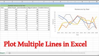
- Value Columns – one or more series you want to plot.
- Optional Helper Columns – for conditional calculations or filtering.
Here’s an example layout:
MonthSalesExpenses Jan1200800 Feb1500950 Mar18001100Make sure the first row is a header, and the data starts from the second row. This structure is essential for the template to recognize the ranges automatically.
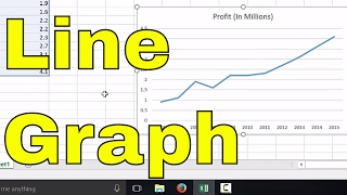
Step 2: Insert a Basic Line Chart
Most spreadsheet applications (Excel, Google Sheets, LibreOffice Calc) allow you to insert a line chart with a single click:
- Select the entire data table.
- Navigate to Insert → Chart → Line.
- Choose the “Line with markers” style for better readability.
After inserting, the chart will display the data series with default colors and markers. At this point, you can start customizing the template.
Step 3: Format the Chart for Reusability
To make the chart a true template, follow these formatting tips:
- Chart Title – Use a placeholder like “[Insert Title Here]” so you can quickly rename it later.
- Axis Labels – Add descriptive labels for the X‑axis (e.g., Month) and Y‑axis (e.g., Revenue ($)