Warm Cool Colors Art: A Practical Guide for Creatives
Whether you are a seasoned painter, a digital illustrator, or an Etsy seller looking to boost your shop’s visual appeal, mastering the relationship between warm and cool colors is essential. Warm and cool hues affect mood, depth, and composition, and understanding how to move between them with hue and saturation gives you the flexibility to create compelling artwork that resonates with viewers.
Understanding Warm and Cool Colors
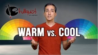
In color theory, warm colors such as red, orange, and yellow are associated with energy, heat, and forward movement. They tend to advance toward the viewer, making a space feel intimate and lively. Cool colors—blue, green, and violet—convey calm, distance, and stability, often receding into the background. This natural psychological response is why artists use warm tones to highlight focal points and cool tones to suggest depth.
Both groups exist on a continuous spectrum. A color’s position on the warm‑cool axis is determined by its hue, while its intensity is controlled by saturation. By adjusting these two variables, you can shift a hue from warm to cool without changing its basic identity.
How Hue and Saturation Shift Between Warm and Cool
Hue is the attribute that defines a color’s name—red, blue, green, etc. Saturation describes the purity of that hue; a fully saturated color is vivid, while a desaturated one appears muted or grayish. The interaction of hue and saturation creates a wide range of expressive possibilities:
- Increasing saturation on a warm hue (e.g., a bright orange) makes it pop, drawing the eye forward.
- Decreasing saturation on the same hue softens its impact, allowing it to blend with cooler surroundings.
- Shifting hue toward the opposite side of the color wheel (e.g., moving orange toward teal) gradually changes the perceived temperature while retaining a similar level of brightness.
In practice, you can use a color wheel or digital palette to experiment. For instance, start with a pure red (warm) and add a small amount of blue. As the hue moves toward magenta, the color feels less hot; add more blue and you reach a cool violet. Simultaneously adjusting saturation lets you keep the color vivid or mute it to suit a background.
Practical Tips for Painting with Warm and Cool Colors
1. Establish a Dominant Temperature
Decide early whether your piece will feel primarily warm or cool. A warm‑dominant painting creates intimacy and energy, ideal for portraits or sunrise scenes. A cool‑dominant work evokes serenity, perfect for seascapes or night skies.
2. Use Warm Accents to Guide the Eye
Place small, saturated warm spots—like a bright orange sun or a red focal object—in a cool‑dominant composition. This contrast naturally draws attention and adds visual hierarchy.
3. Create Depth with Temperature Shifts
Apply cool colors to background elements and warm colors